
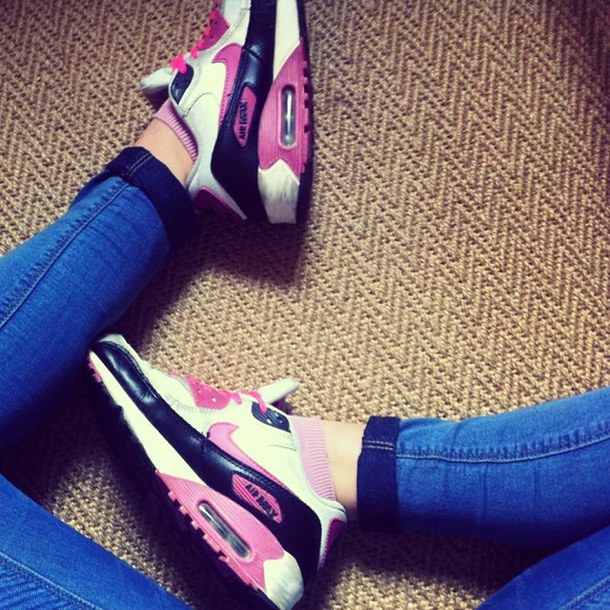
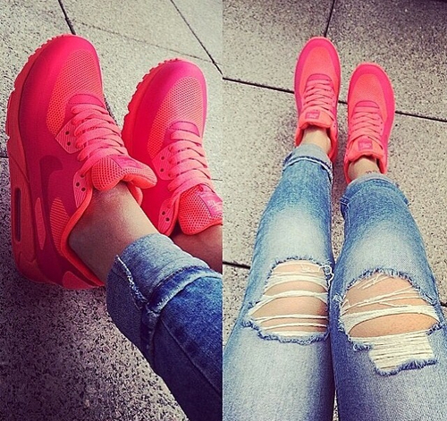
The Air Max is more than a shoe, it is an icon. It has a simple, yet bold design that exudes Nike cool in a way that speaks just as loudly to the hippest hipster and the mall mom.


Homepage Hero Images
The challenge was to convey a dual-gender, multicolor story that stayed true to the Finish Line brand standards.

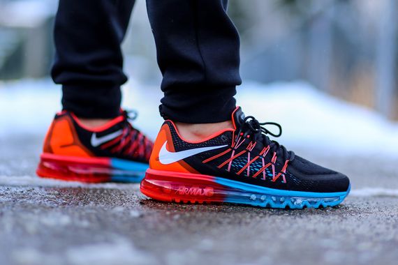
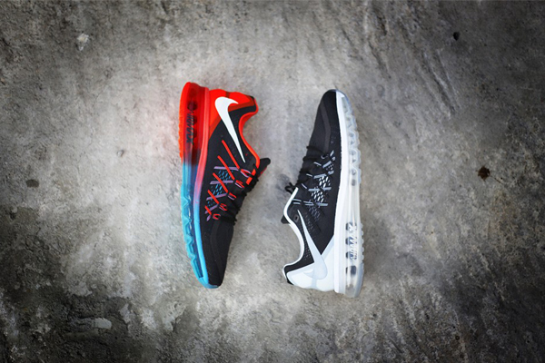
For the first image I wanted the products to do the talking. Finish Line has a great range of colorways for the 2015, so I gave them a simple background that would fit in with the rest of the site while letting the colors pop individually. I also chose the subtle floating effect to reinforce the idea of "air".
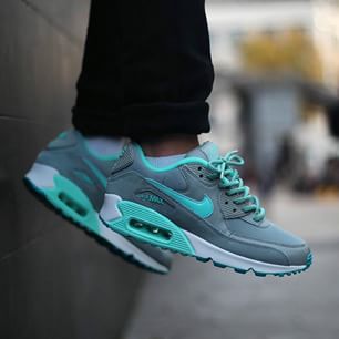
For the second lifestyle focused image, I chose the photo above for it's simplicity, the images with additional text (i.e. Metlife blip, or Hollywood sign) would be too busy with the inclusion of copy. I also like the sense of adventure that the image conveyed, working well with the copy "Dare to Air". I oriented the copy vertically to add to the sense of height.
Email Design
The challenge was to tell the full Air Max story using shoe product shots, Laydown Apparel and Blog Content featuring lifestyle imagery.
For the email design, I wanted to let the products speak for themselves, keeping the layout simple, while showing a range of product types across both genders.
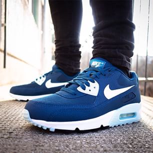
I chose the blog image because of how it displays movement suggesting the timeliness and immediacy of the content readers receive.